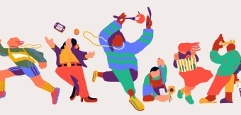

Charged with building an end-to-end rework of Peopleway’s brand identity to better reflect its positioning, Wipro-owned global experience innovation consultancy Designit sought to cut through the complicated conversations around human behaviour and the inner workings of artificial intelligence and instead communicate what Peopleway stood for in accessible terms.
We spoke to the team at Designit to learn more.
What was the brief for the rebrand?
Peopleway, which has firm roots in behavioural psychology and a strong legacy in human behavioural measurement, wanted to reposition its brand to evolve its offering from simply understanding human behaviour to instead actively accelerating the human behaviours that drive positive business outcomes.
This move coincided with the launch of Peopleway’s new cloud-based AI solution. Designit was brought on to completely rethink the brand identity of Peopleway, keeping its heritage alive while at the same time giving it an identity all its own in a very crowded AI-powered market.
How did the initial pitch/brainstorming phase go?
The initial brainstorming phase included national and international market research to define a new positioning and strategic brand platform.
As Peopleway is entering a quickly evolving technological landscape, the discussions about a unique position were informed by reflections on what might come next. This led to a strategic direction that was rooted in the company’s legacy and values.
Describe the purpose of the brand and its target audience
The rebranding objective was twofold: first, to preserve the rich heritage Peopleway has built as a behavioural measurement specialist, and second, to position the business as a leader in utilising proprietary AI tools to influence employee behaviour positively.
This aligned with Peopleway’s central business objective of widening its target audience from predominantly HR professionals to the C-suite and directly targeting the budget holders in clients’ businesses.
What was your thinking behind the rebranding solution?
Designit sought to cut through the complicated conversations around human behaviour and the inner workings of artificial intelligence and instead communicate what Peopleway stood for in accessible terms.
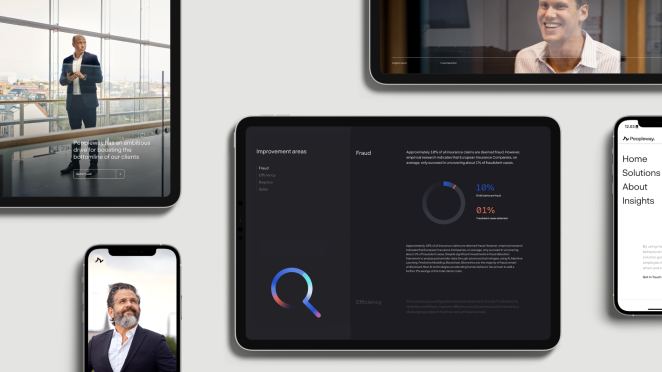
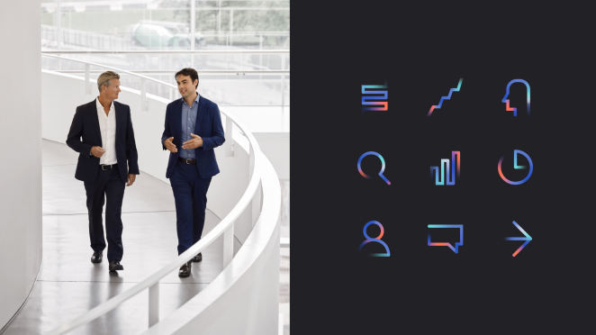
The pictorial mark represents how a machine learning model parses information and how neurons work in the brain; this metaphor is also carried through into the bespoke animations we designed.
Did you learn anything new during the project?
Not necessarily new, but when reinventing a brand, it’s essential to both align core stakeholders and get buy-in from the wider business on the new strategic direction. For Peoplway, this involved senior management, encouraging strong participation and empowerment to adopt the new narrative within their teams.
What was the biggest challenge? How did you overcome it?
Creating a solid and impactful visual identity that builds brand equity for an AI business amid the daily technology breakthroughs in the space was a massive challenge.
Ultimately, having a strong core essence to the brand outside of AI and an impactful visual identity that dovetails into the creative was the key. We are excited to see the brand and visual language grow in the coming years.
What kit/tools/software were used to create it?
Our main design tool is Figma for concept designs and presentations, with a range of Adobe Creative suite tools for specific applications. Cinema4D was a central part of developing and animating the key visuals, animations, and explainer film.
What details are you most proud of and why?
We managed to make the brand feel dynamic - visualizing Peopleway as an energetic path that accelerates clients forward. Striking a balance between being at the forefront of technology and being trustworthy based on years of experience.
What visual influences fuelled your solution?
We conducted a visual audit of competitors and looked at the landscape of related AI companies, seeking a visual space that wasn’t occupied but, at the same time, instantly felt associated with contemporary tech.
With Peopleway being an AI-driven company, we were directly inspired by neural network graph visualisations. These are often highly complex charts, with dots connected by dozens of interconnected lines showing the flow of information.
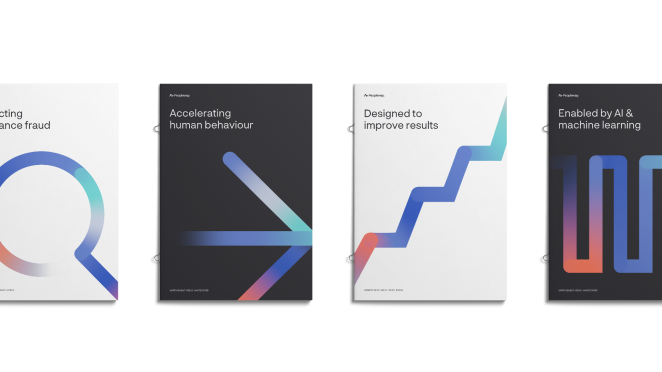
Our idea was to visualise this path through complexity with a single, simplified 3-dimensional line, representing how Peopleway guides its clients through the complex landscape of behavioral data, showing the clear path forward.
The visual language we developed uses a vibrant, complementary color palette, dynamic shapes, and motion graphics elements that invite engagement, fostering a sense of energy and approachability.
What do you hope it achieves for the brand?
The hope with this rebrand is that it allows Peopleway to retain the incredible legacy it has built while also creating a positioning that makes it future fit.
The worlds of AI and human behaviour can get very complicated very quickly; we hope that the brand guidelines we’ve built for Peopleway mean they can communicate the complex in a simple and impactful way that resonates with its core audience.
What would you do differently if you could do it over again?
Honestly, I don’t think we’d do much different at all! This was a learning experience for us and a difficult challenge from a design perspective. It’s like designing a way to have your cake and eat it too, keeping the best parts of a brand's heritage while positioning it for future success!
Credit list for the work?
Frida Setterberg, Head of Studio
David Ramskov Hansen, Director, Client Service
Anne-Sofie Voss, Lead Business Designer
Aya Vibe Massoulier, Lead Brand Activation Designer
Emilie Østergaard Jakobsen, Senior Business Designer
Jakob Holmberg Chrøis, Senior Brand Designer
Mikkel Hendeliowitz, Senior Digital Designer
Frederik Lundhøj Aaltonen, Account Manager
Anna Brorson Olsen, Brand Activation Designer
Sara Vujic, Junior Designer